©Artwork by Suzanne B. Stryker
Did you know that everyone sees color a little differently? In this blog post, I talk about the mysterious language of color. Because we are used to the way we see colors, many of us may not be aware that we have some degree of colorblindness.

The following experience, reported as a result of my services, seems appropriate for our topic at hand:
"Layer upon layer of unfoldment within light. At some point, energy came up from the earth, up through the chakras, which were bathed in light, but each clear chakra was a bubble. The energy rose through them, rendering an inaudible tone for each. The sequence continued––energy from earth, through each chakra, delivering a silent tone. The pace continued to accelerate and then there was just a rush of that energy flowing unobstructed through the chakras and up and out of the top of my head to the environment. The whole internal subtle body was awake with white light, flowing light from earth to heaven. Today, during my Transcendental Meditation program, that white light flow became golden sparkling light, vibrant within itself."*
Jim Rocca More

The Secret Language of Color
In ancient civilizations, color was explored for its healing properties. Light therapy was practiced in ancient Egypt, Greece, China and India. The Egyptians utilized sunlight as well as color for healing. The colors around us have more effect than we might think. Colors affect our mood, perception and social interactions. We also have acquired attitudes about certain colors based on our culture and belief systems. For instance, black can be associated with mourning and also a formal dress occasion, such as a black-tie affair. Red is thought of as stimulating, romantic and feminine, yet it is also seen as a signal of danger. Think of red roses, red hearts and red stop signs.
There are many philosophies about color therapy, but in general, warm colors are said to arouse or stimulate the viewer. This is why you see warm colors like red, yellow and orange in many restaurants.

Although we know that freshly prepared meals are nutritionally superior to fast food, McDonald's mustard-and-ketchup-colored logo does seem to stimulate the appetite.
McDonald’s even uses color philosophy to try to change people's belief that they are not environmentally friendly. Many franchises in Europe have incorporated the color green into their storefronts and interior design because green is associated with being environmentally friendly. Cool colors such as green, blue and violet are said to be healing, calming and relaxing.
Experiment
Rather than get into a long discussion about the various philosophies of color therapy, I thought I would let you see for yourself how color affects you. Look at my blue painting below. How do the blue and green colors make you feel? Then look at the manipulated version in red. Did you notice a shift in how you felt? Note that if you are colorblind, some colors may appear a lighter shade, a different color or even gray.


©Artwork by Suzanne B. Stryker
Colorblind?
What numbers do you see pictured below? The correct answer will be given further below.

Everyone sees color a little differently, even people who aren't colorblind. However, if you are colorblind, you don't see colors the way most people do. Symptoms of colorblindness are often so mild that you may not notice them.
Colorblindness runs in families. People are usually born colorblind, but sometimes it shows up later in life, often because of cataracts.
Answer: The number embedded in the above illustration is 26. People that are red colorblind see only a 6. People that are green colorblind may only see a 2.
Websites like colorlitelens.com have in-depth colorblindness tests, but please note that computer-based colorblindness tests are not completely accurate because computer displays only have three primary colors. Your local library or eye doctor may have accurate tests.

In the above pictures, the top row of a red apple and a green apple show how they normally appear, and the bottom row shows how washed out the colors look to a colorblind person.

In the above illustration, the top row shows normal vision of color as seen by about 92% of the population. The lower rows illustrate how color appears with various kinds of colorblindness and the percentage of the population with the corresponding conditions. Difficulty distinguishing between red and green is the most common form of colorblindness, followed by blue-yellow colorblindness. Red-green colorblindness affects up to 1 in 12 males (8%) and 1 in 200 females (0.5%). That could explain some unusual color combinations people wear.
©Artwork by Suzanne B. Stryker
Interesting Facts
- The ability to see color decreases in old age.
- If you are colorblind, you cannot obtain a driver's license in China or Russia.
- In some countries, colorblind individuals cannot become aircraft pilots, train drivers, crane operators, or join the armed forces.
- Colorblindness can make it difficult to read traffic lights. Some eastern provinces of Canada came up with a clever solution. The traffic lights are differentiated by shape in addition to color: square for red, diamond for yellow and circle for green.
- In a camouflaged environment, colorblind individuals might see better than the ordinary person. In World War II, colorblind observers were used to detect camouflaged positions.
Conclusion
In conclusion, not everyone perceives something as simple as color the same way. It is no wonder that we have varied points of view about everything else in the world too. Since we cannot force our point of view on someone else, let's join hands, dance and celebrate our differences.
Love,
Suzanne

Fascinating look at colors! Interesting that red and green can look about the same to someone who is colorblind.
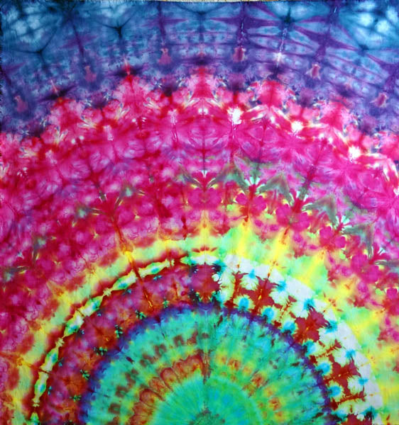
I’m not particularly a fan of tie-dye in general, but that last painting feels like it’s undulating. Very cool
I enjoyed this article on color blindness and how colors affect us. I especially liked the comparison Canada has for finding a solution for traffic lights and color blindness! Yes we all perceive the world differently. I like to say “ That’s one way to look at it” with different viewpoints.
Jim Rocca’s experience was beautiful. Reading it enlivened something within me. I’ve read about colorblindbess but I didn’t realize there were so many variations of colorblindness. Thank you for this informative explanation and chart.
All love to you, divine Suzanne!
I liked your comment in another post, a line in a poem that said that black is the mother of all colors. That reminded me of Genesis that says that says the earth was without form and void, and darkness was over the face of the deep. And the Spirit of God was hovering… And then I am also reminded of Lao Tzu who said, “Darkness within darkness, the gate to all mystery.” Cool.